Achla
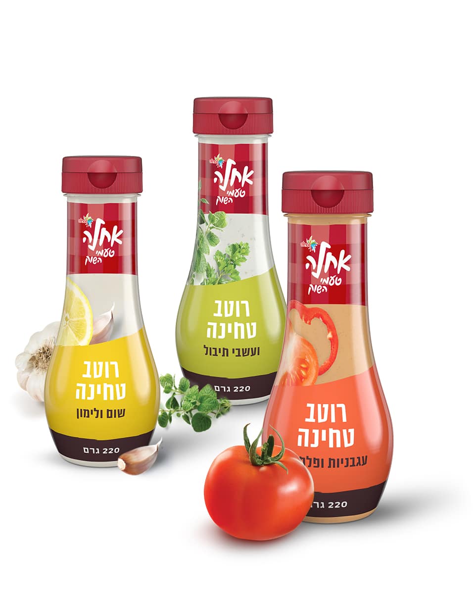
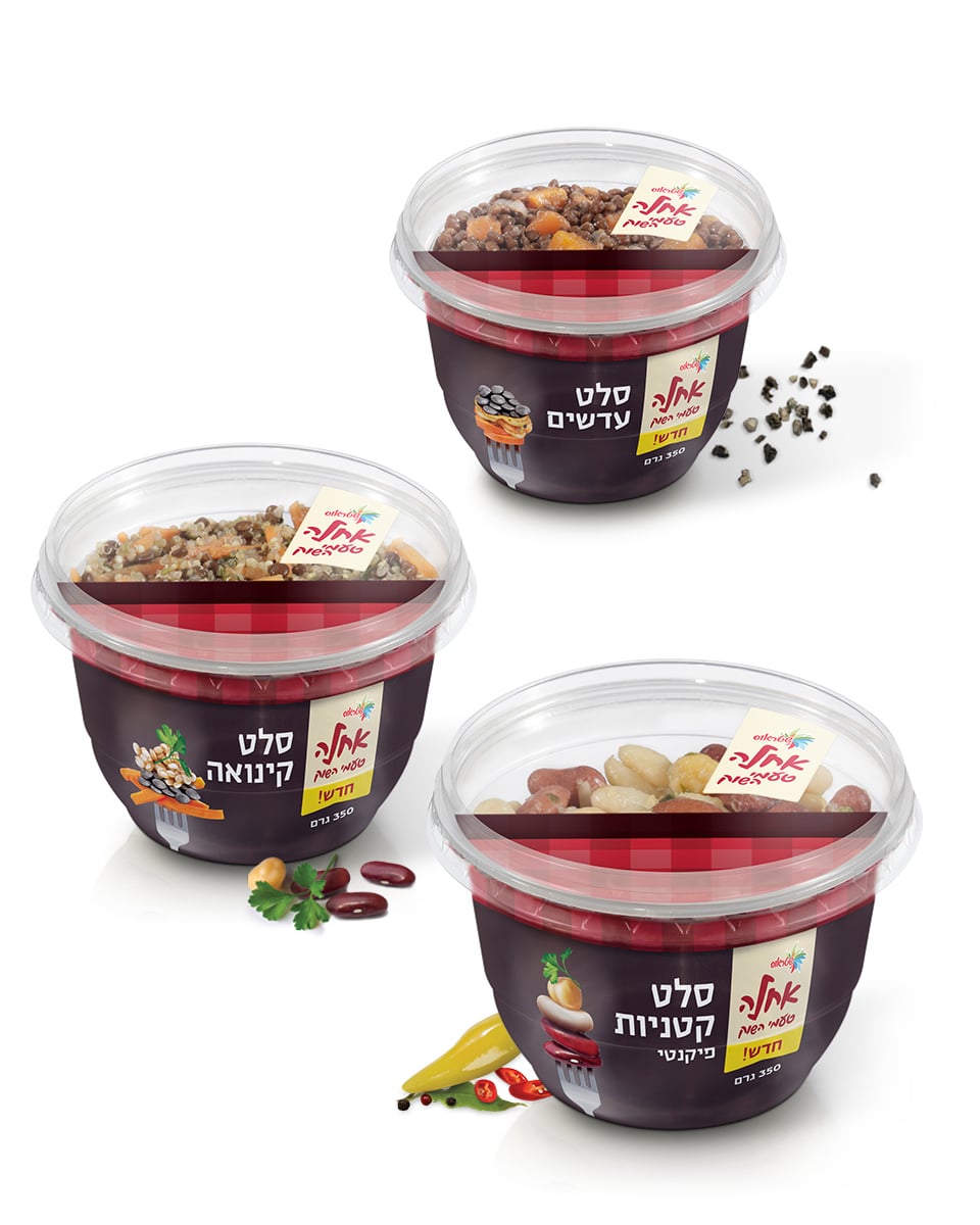
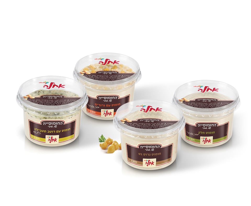
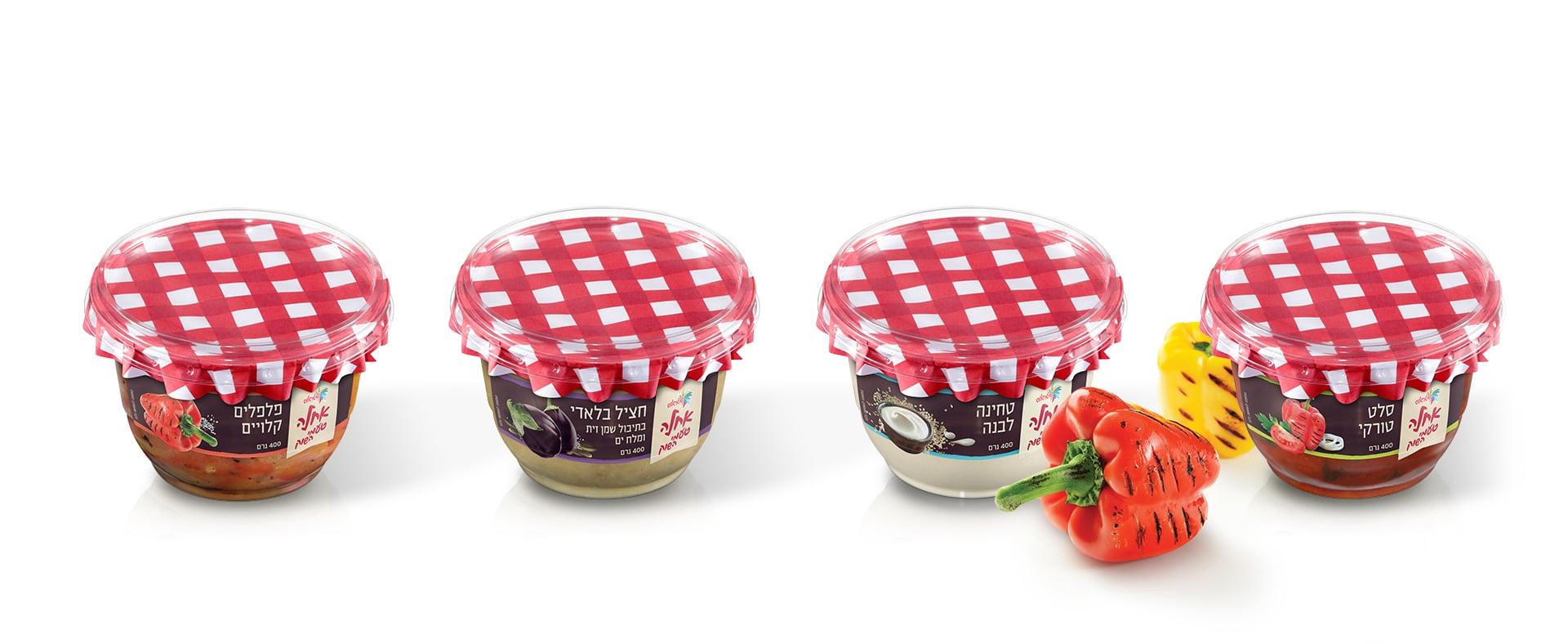
The increasing competition and the old-fashioned industrial feel of the Strauss Achla product line meant that the brand was in dire need of a face lift. The change started with the product itself: Strauss launched a new and interesting product line which was, most importantly, closer to the produce – just like you would get at a home or a deli.
The purpose of the re-brand was to allow the produce, simplicity and joy to shine through, shake the old industrial feel and give it a new, natural and fresh feel.
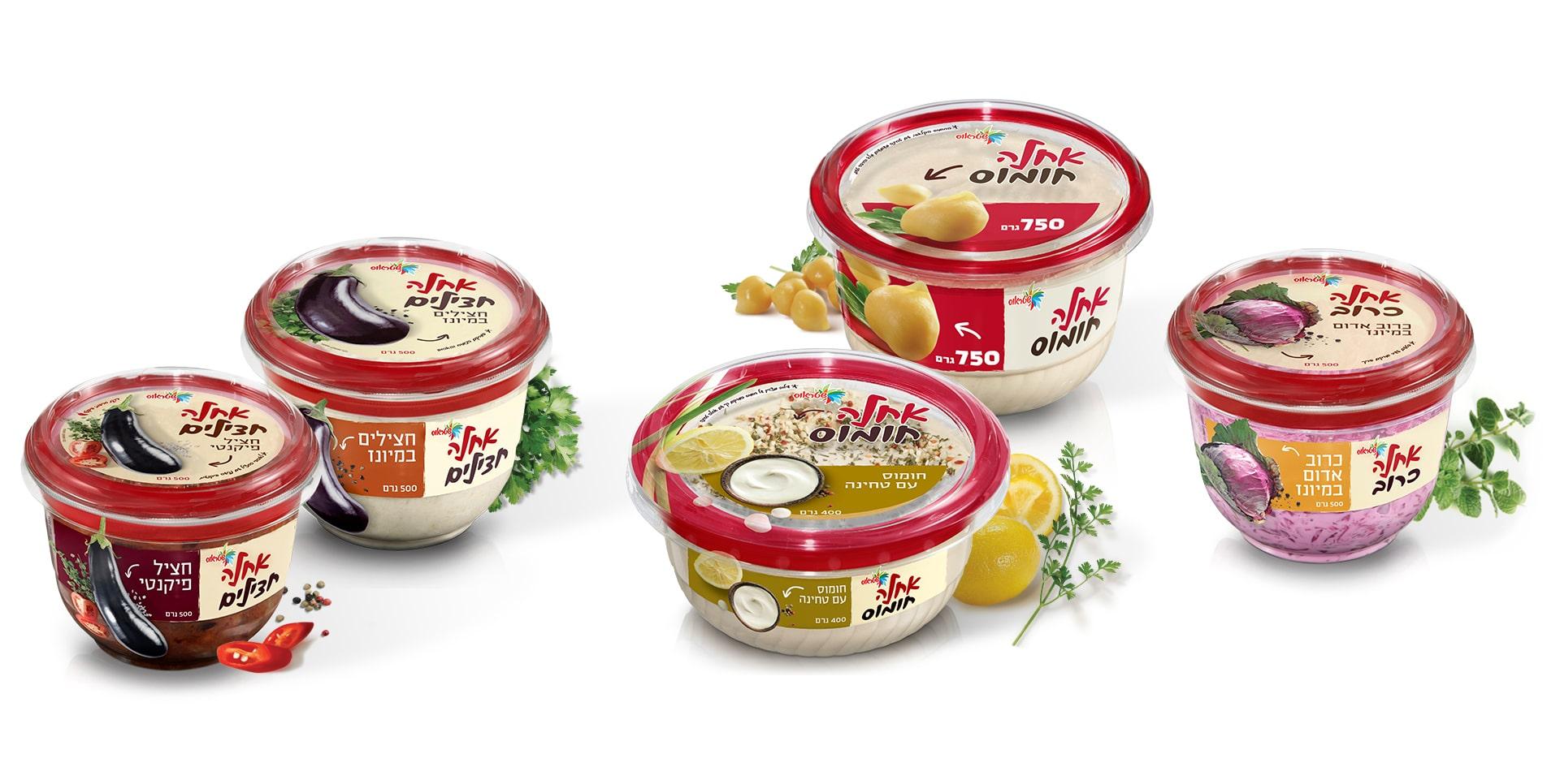
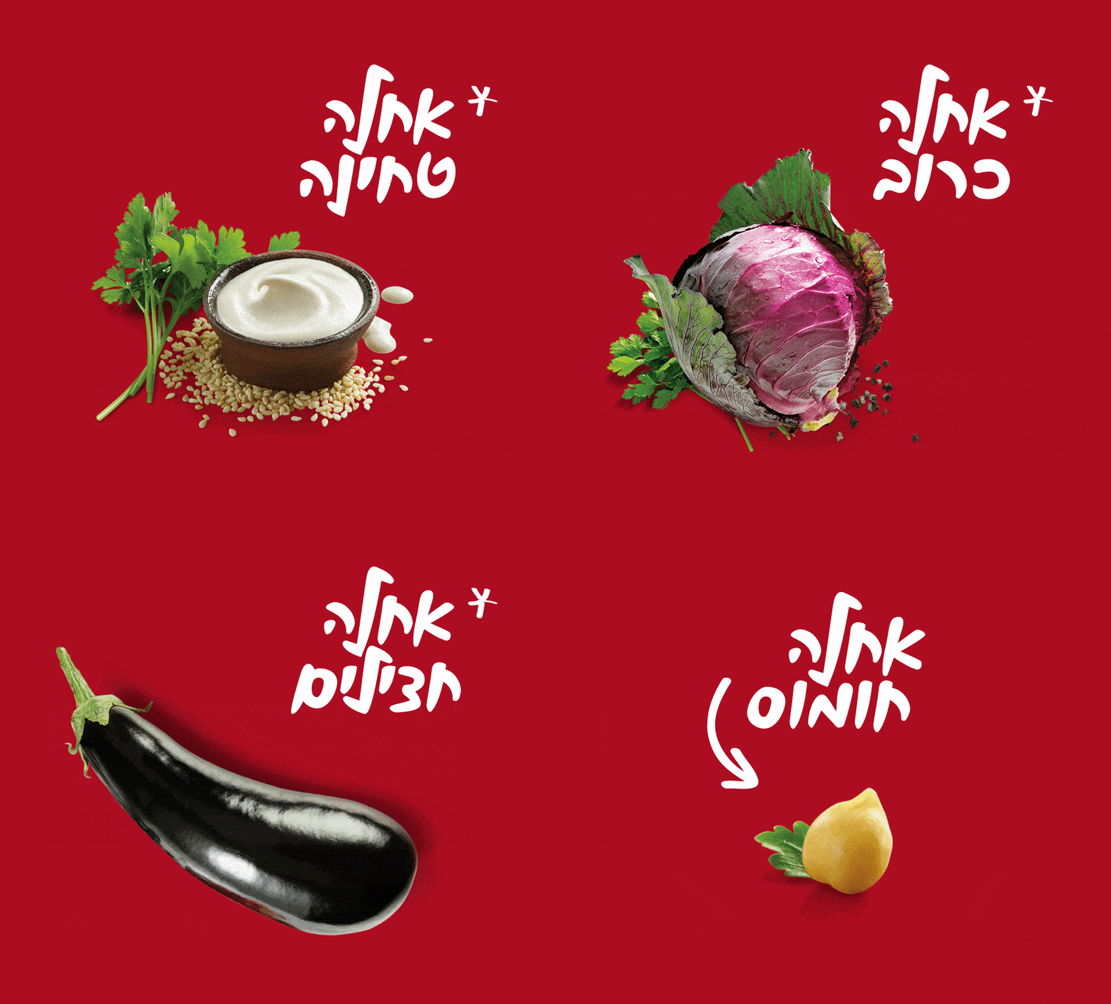
In order to cultivate the natural image, we placed a large picture of the vegetables in their natural form, as they are just before preparation. The inspiration for this approach came from the field or the market, in which we can see each eggplant and chose the best one of them all.
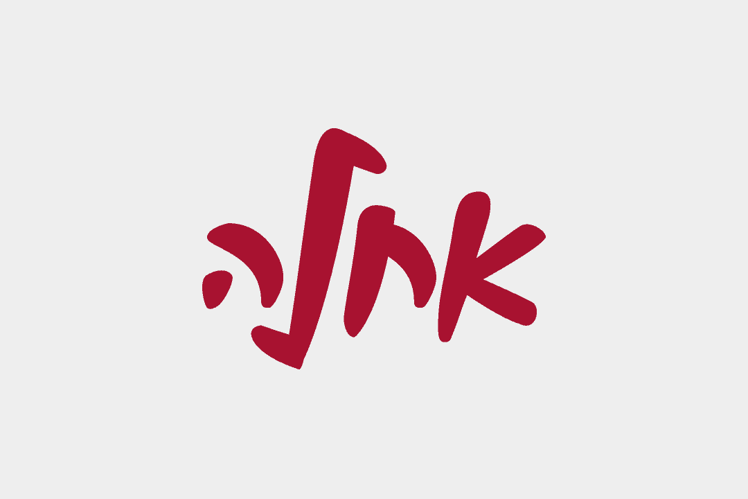
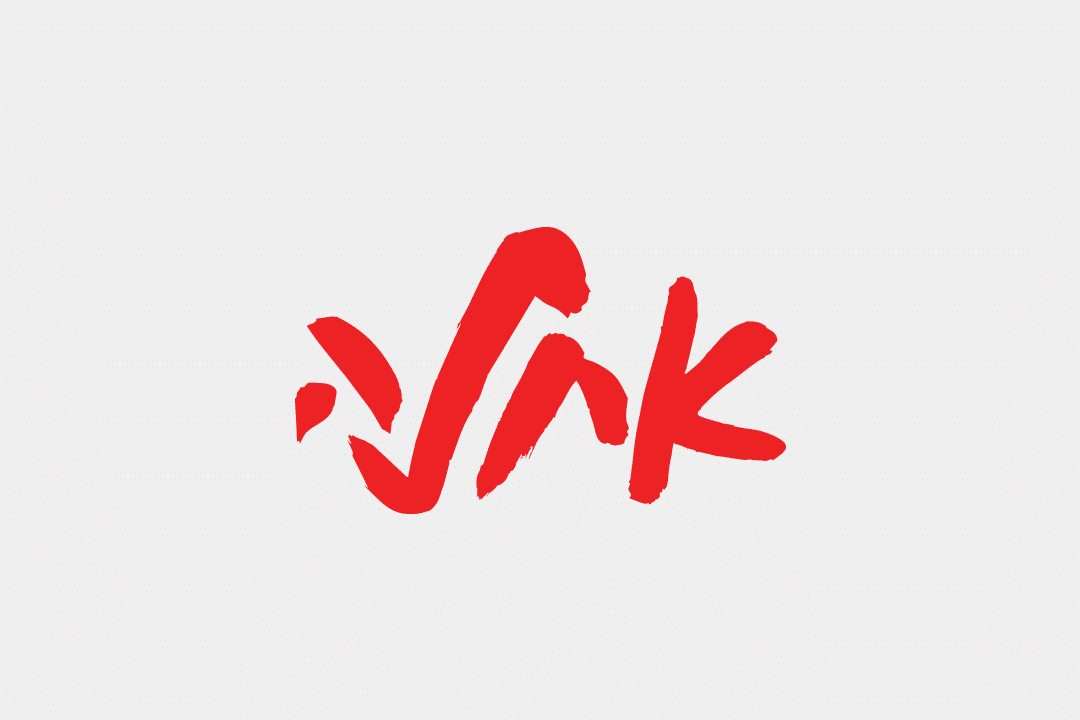
We tried to imprint the same feeling with the packaging on the shelf – each eggplant has a story and he is the star of the package. As an additional step towards emphasizing the product and simplicity, we redesigned the Achla logo and a matching hand-written font was added.
